
A redesign that turned into a rebuild
Village Lift came to us for a redesign.
What they needed was a rebuild
Village Lift is a women-led social enterprise in Fair Haven, New Jersey. They sell clothing, art, and home goods made by women entrepreneurs, and the net proceeds go back into the community. The mission was clear. The storefront wasn't carrying it.
What started as a homepage refresh became a full rebuild. A custom theme, a new style guide and palette, a catalog of more than 400 products restructured from the ground up, and a set of features we built rather than installed.
A catalog fighting the store it lived in
Every color and print of the same style sat in the catalog as its own separate product. A shopper looking for one kimono scrolled past nine near-identical listings to find it. The navigation had grown to compensate, stacking category after category until the menu was doing work the product pages should have been doing.
The storefront itself read like a template. Pink chrome, stock spacing, and a homepage that opened on a photo instead of a reason to stay. None of it reflected a business built on craft.
Underneath that, the product data had nowhere to put the things that actually sell a handmade piece: what it is made of, how it is made, how it fits, and how to care for it.
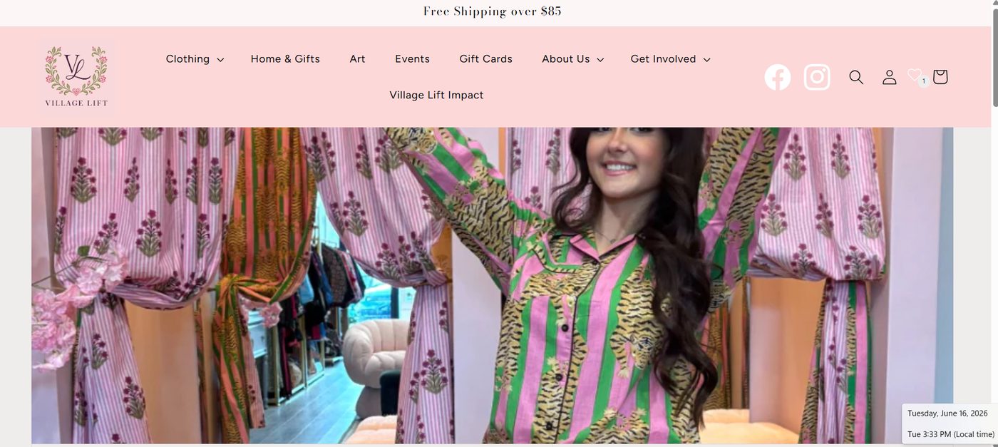
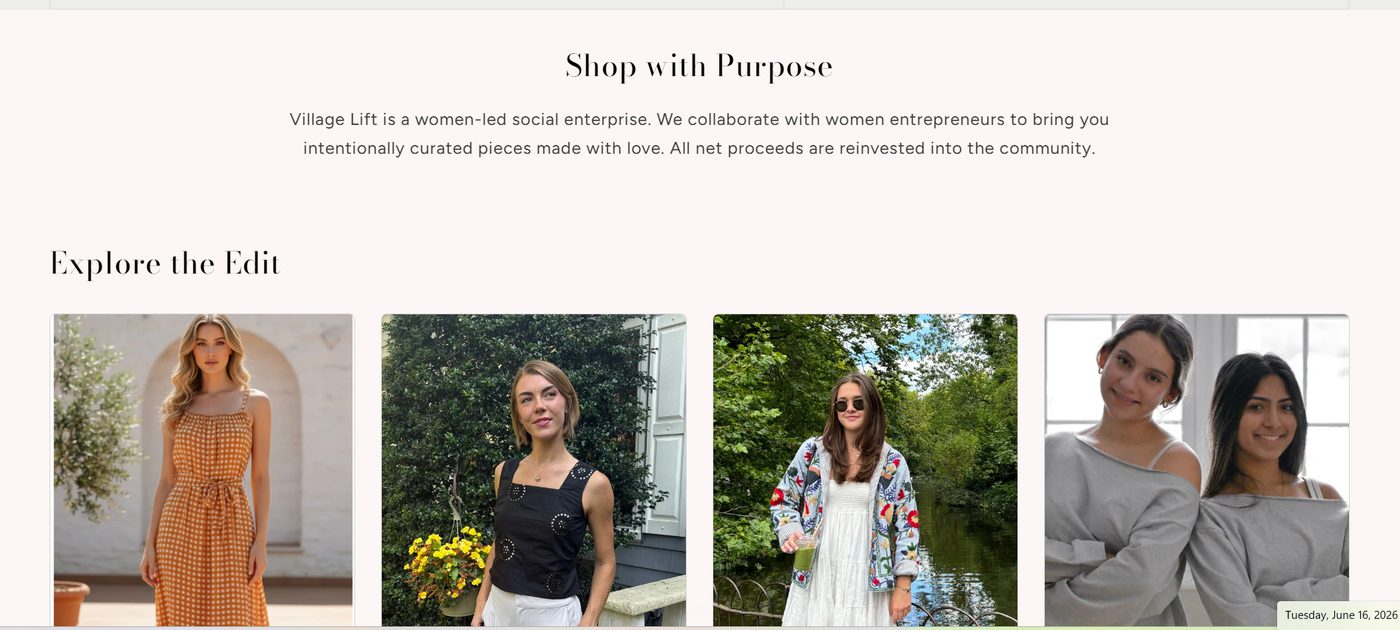
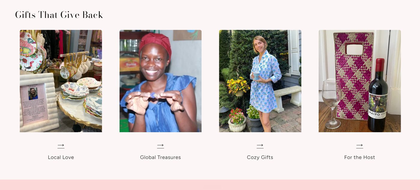
The homepage, mission section, and gift categories before the rebuild
A look drawn from their own logo
We pulled the palette straight from the Village Lift crest: plum, rose, and forest green, set against warm neutrals. A new style guide locked type, spacing, and color so the site stays consistent as the team adds to it.
The homepage opens on a three-panel hero rather than a single image, so the first screen carries the product, the mission, and the invitation at once. Category pages got gradient headers that hold up against heavily patterned photography instead of fighting it.
The result reads like a boutique that chose its own look rather than inheriting one.
More than 400 products, restructured
We migrated the entire catalog from simple products to configurable ones. Same-style-different-print items collapsed into single products with their prints as selectable options, and real color swatches went onto the collection pages so shoppers can see the variants before they click.
New product fields carry what the old data couldn't hold: material, the making, size and fit, and fabric and care. The team writes the story once per style instead of once per color.
Features we built instead of bought
The product gallery was rewritten to show only the images for the color a shopper has selected, rather than every image for every colorway. Small change, and it removes most of the scrolling from a heavily patterned catalog.
Reviews and the Complete the Look upsell were both built custom rather than installed as apps, which keeps the pages fast and the styling consistent with everything around them.
What we built
Ready to build something remarkable?
Whether you're launching a new brand, redesigning an existing website, or rethinking how customers experience your business, we'd love to hear what you're building.
Book a CallView More Work